Dashboards
AQMIS CLOUD
Dashboard Benefits
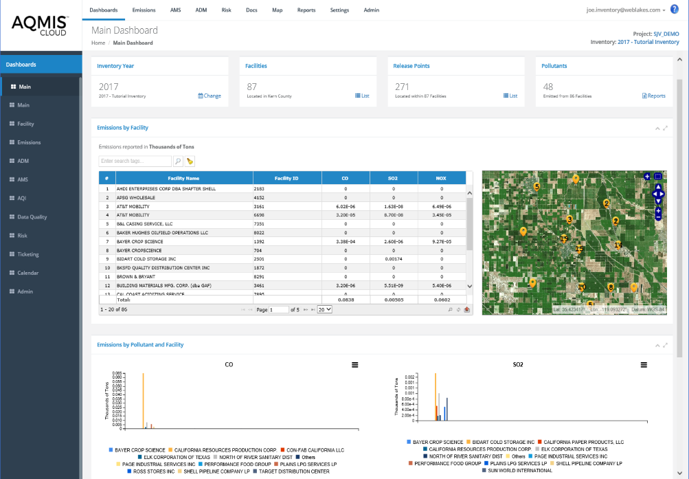
Main Dashboard
The Main Dashboard provides users with concise summary level information including:
Easy to use navigation tools as well as advanced search and filtering options allow users to quickly find the information they are looking for.
Users can customize their dashboards to view the information they are most interested in. For example, users can select the list of pollutants to display such as criteria, toxics, or GHGs.
Users can customize their dashboards to view the information they are most interested in. For example, users can select the list of pollutants to display such as criteria, toxics, or GHGs.
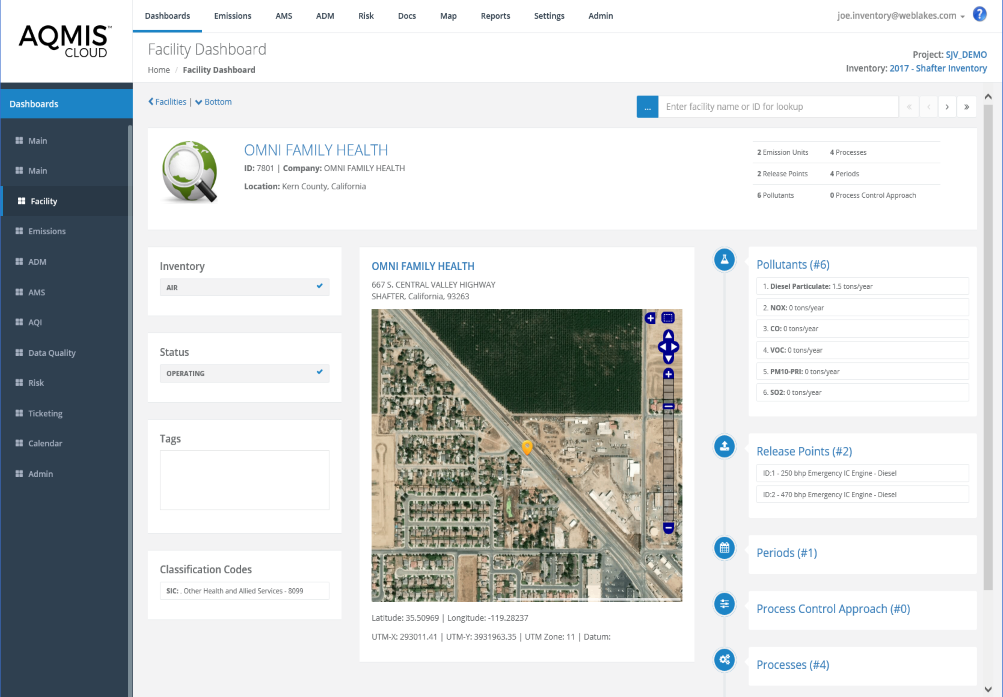
Facility Dashboard
The Facility Dashboard provides users with concise summary level information about the selected facility including:
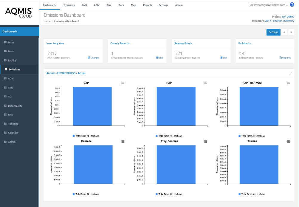
Emissions Dashboard
Visualize and analyze emission inventory data in a multitude of ways including:
- Data aggregation by:
- Source types
- Regional Designations
- Attainment Zones
- Facilities
- Emission sources
- Pollutants By Category
- Temporal analytics and trending
- Trend analysis over multiple inventory years
- The emissions dashboard is user customizable to meet the specific requirements of your role and responsibilities. For example, you may be interested in air toxics while someone else may be responsible for managing GHGs or criteria pollutants
- Generate formatted reports for online visualization or export data in common formats including PDF, Microsoft® Excel, Microsoft® Word, CSV, XML, and Tiff
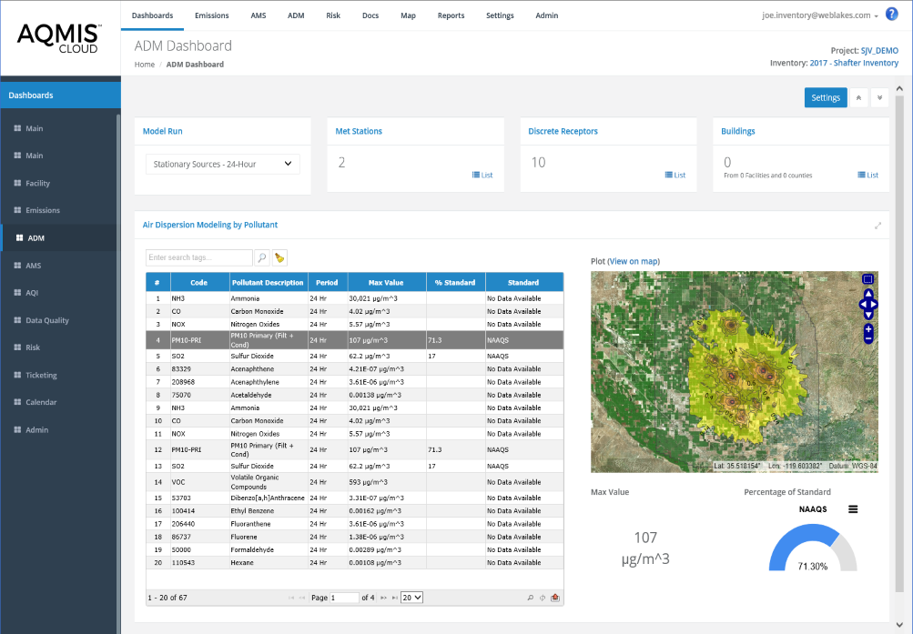
Air Dispersion Modeling Dashboard
- The Dispersion Modeling (ADM) Dashboard provides users with concise information on the location and magnitude of pollutant-specific modeled air concentrations including:
- Maximum pollutant-specific concentrations
- Maximum offsite concentration
- Concentration gradient contour map
- Percent of applicable regulatory standards
- User selectable library of air dispersion modeling scenarios including Historic, Real-Time, and Forcast.
- Source attribution profiles are provided to identify which emissions sources or source groupings are causing the highest impacts across the modeling domain
- View multiple inventory years, trends, and comparison of modeled versus measured.
- Concentration contours are automatically generated and visible on the map. Users can easily customize contour settings such as color ramps, contour intervals, index values, labels, and color outlines.
- Pollutant contour maps can be viewed online or exported to share with additional stakeholders
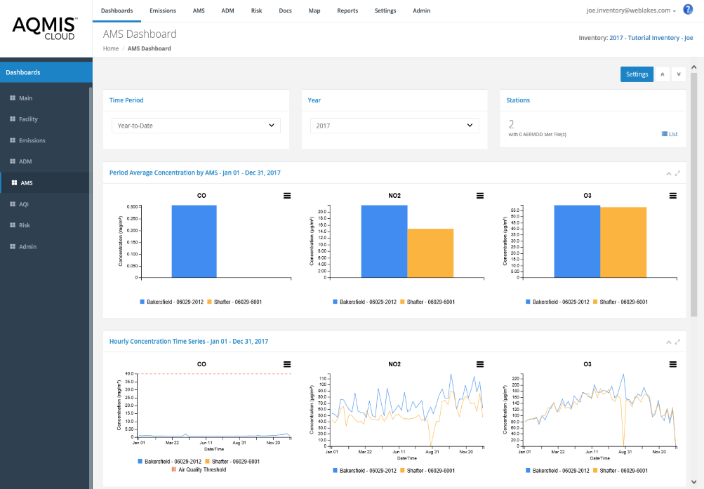
Ambient Monitoring Station (AMS) Dashboard
- Quickly identify exceedances of regulatory thresholds (e.g., Criteria Pollutants) or other user defined target levels
- Identify areas within the network with the highest and lowest pollutant concentrations
- Visualize data trends to identify temporal and spatial correlations
- Visualize ambient air monitoring data in a multitude of ways including:
- Time series bar charts
- Line charts
- Wind rose plots
- Pollution rose plots
- Pollution rose plots make it easy to identify upwind sources impacting the ambient monitor
- Perform trend analysis by plotting multiple years of data
- Visualize temporal patterns including seasonal or daily fluctuations in air concentrations
- Charts are interactive where users can highlight specific data and turn data elements on an off to customize the display of results
- Automatically calculate an Air Quality Index (AQI) to inform the public on the current and forecasted levels of air pollution
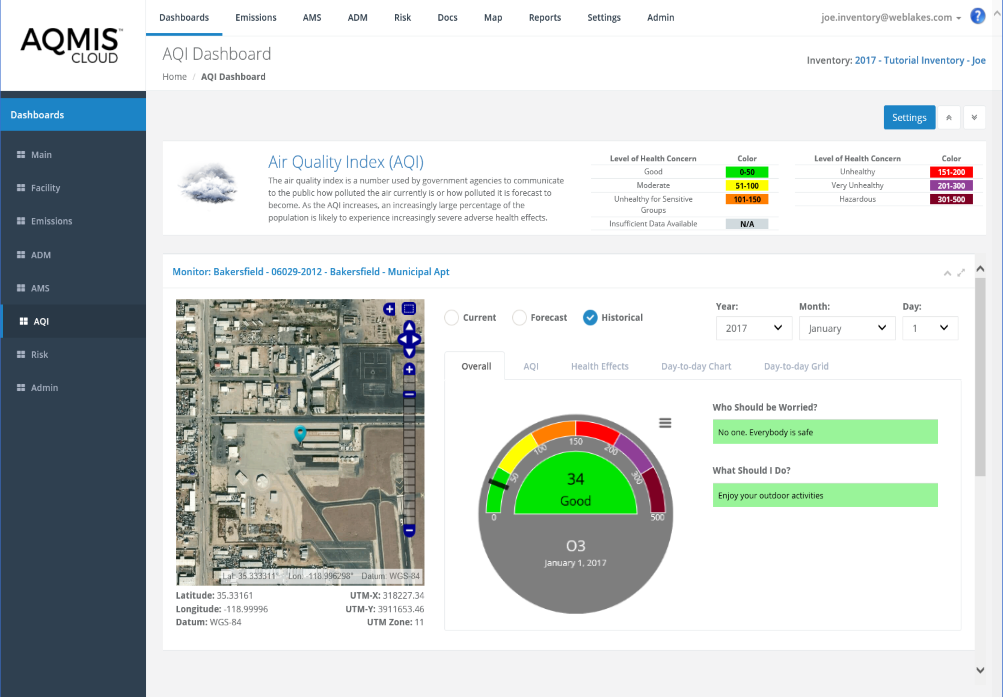
Air Quality Index (AQI) Dashboard
The air quality index is a number used by government agencies to communicate to the public how polluted the air currently is or how polluted it is forecast to become. As the AQI increases, an increasingly large percentage of the population is likely to experience increasingly severe adverse health effects. The AQI value ranges beteen 0 – 500.
The AQI dashboard provides calculated AQIs for all active ambient air monitors following the U.S. EPA calculation method. Available results include historic, current and forecasted AQI. The following information is provided so people can plan accordingly to limit their exposure to air pollution:
The AQI dashboard provides calculated AQIs for all active ambient air monitors following the U.S. EPA calculation method. Available results include historic, current and forecasted AQI. The following information is provided so people can plan accordingly to limit their exposure to air pollution:
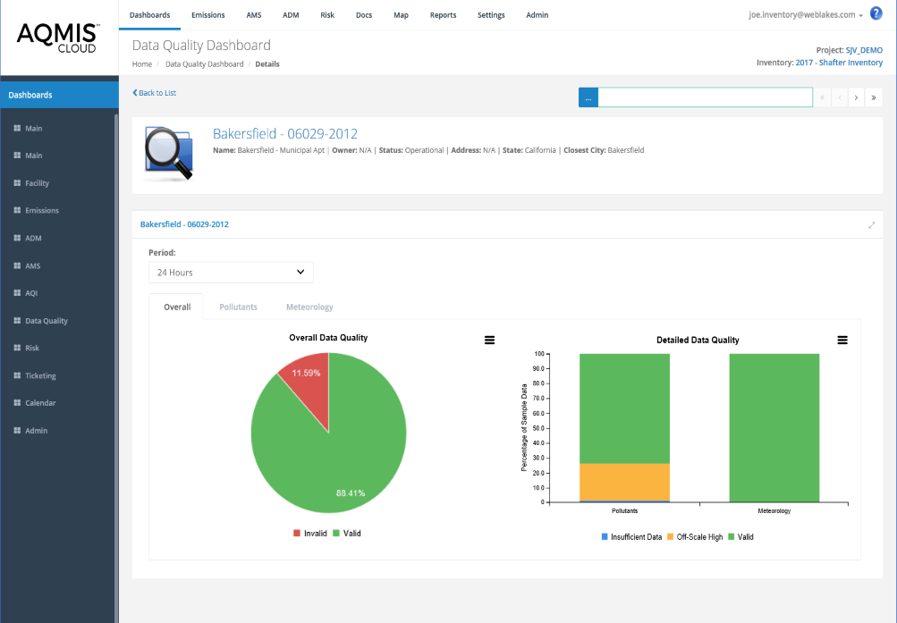
Data Quality Dashboard
The Data Quality Dashboard provides a summary of data quality including completeness (the amount of data present or missing) and validity (is the data of acceptable type and within an acceptable range). Data quality classifications include:
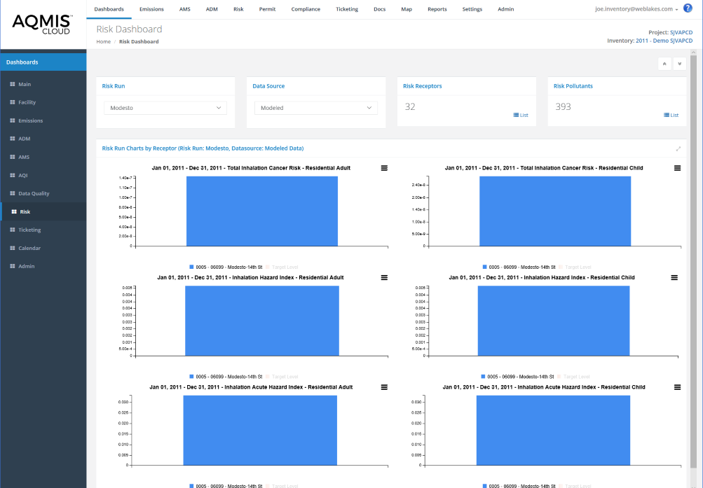
Risk Dashboard
- The Human Health Risk Assessment (Risk) Dashboard provides users with concise information on the location and magnitude of pollutant-specific human health risks including:
- Chronic cancer risk
- Chronic non-cancer hazard
- Short-term acute
- Data visualization includes identification of cumulative and by pollutant specific cancer risks and hazards, including consideration of applicable regulatory risk target levels.
- Exposure scenarios include:
- Resident Adult and Child
- Fisher Adult and Child
- Farmer Adult and Child
- Exposure pathways include direct inhalation and indirect ingestion.
- The graphs include regulatory risk target levels to quickly identify risks that are above target levels of concern.
- Human health risk can be calculated using modeled or measured pollutant concentrations.
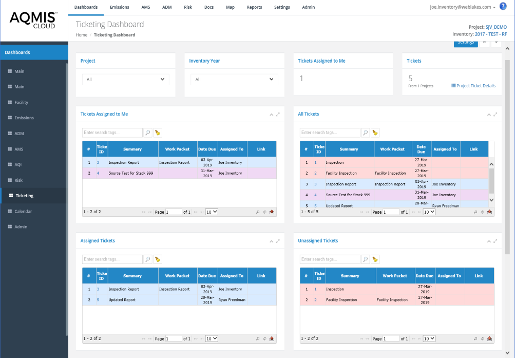
Ticketing Dashboard
The Ticketing Dashboard provides a summary of tickets managed within the system and their current status including:
Each ticket is color coded to provide further information regarding its status. Users can search for tickets and apply multiple tags to further filter the information that is provided.
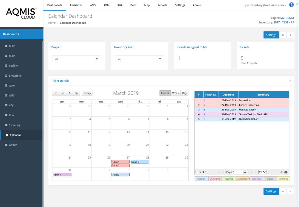
Calendar Dashboard
The Calendar Dashboard provides a summary of tickets based on the dates they are due or were completed. Tickets are color coded to identify the assigned status. Users can click on tickets to quickly access the details. The calendar can be viewed by Month, Week or Day.
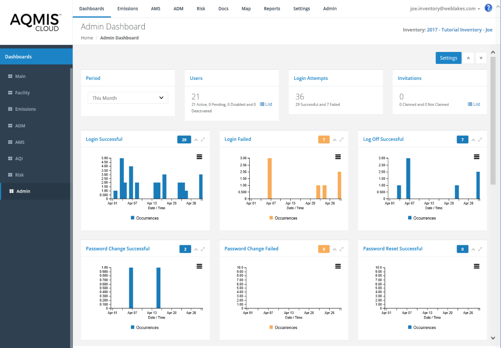
Administrative Dashboard
The Systems Adminstration Dashboard provdies authorized users with concise adminstrative information including:
- Login statistics including
- Successful
- Login failed
- Log off successful
- Password management including:
- Change successful
- Password change failed
- Password reset successful
- Password reset claim successful
- Password reset claim failed
- Project selection successful
- User Invitation Management
- User locked out
- User unlocked
- User invite sent
- User invitation claimed
- Shadow user Management
- Shadow user log on successful
- Shadow user log off successful
- Interactive and users customizable summary charts and graphs